Glossy vs Matte: Finding Your Perfect Photo Finish
In this day and age, most of our photos are viewed on screens. They’re saved in folders on our computers or perhaps in a thoughtful online slideshow or gallery. However you view them on your screen, there’s a translation step to be made when you print them. Most people’s immediate thought is around how big to make their print or prints. The next consideration, which is also quite important and is sometimes treated as an afterthought, is which of print finish to choose.
The print finish you choose can have a big impact on the look and feel of your photos. We’ve all heard of glossy photo prints and most of us have heard of matte prints. But there are far more options than that available these days. How do you know which finish is right for the photos you plan to print?

First, a Stylistic Disclaimer and Confession
I should lead with the statement that one photo finish isn’t necessarily superior to another, as a general rule. It isn’t as simple as glossy vs. matte. Different styles of photography can benefit from different finishes. The finish you choose can help you achieve a more specific feel to your images. For example, if you’re wanting to make large prints that have a fine art look to them, choosing a matte finish probably makes the most sense. If you have super colorful and vibrant vacation photos, you might choose a different finish.
I photograph people for a living - I photograph families, high-school seniors, small brands, and singles. The commonality in these they all require the truest of skin tones, the most flattering contrast, and gentle gradations in the light and dark parts of the images. Because of this, there are certain photo finishes that are my go-to ones and certain finishes that I typically avoid.
The one photo finish I (almost) never choose… is glossy. What?!You might be thinking: “Isn’t that the most popular finish for photos”? Glossy has been the most common standard for decades. It is still sometimes the only option at drugstore print labs, and other print labs of that caliber. But glossy has some big drawbacks. Besides, there is a different common print finish that isn’t too dissimilar from glossy that can both make your photos shine and look a bit more modern. That finish is called lustre. ✨
Why Lustre Over Glossy?
If you found this blog post, you were most likely wanting to compare glossy vs matte photo finishes. Now I’m suggesting that you ditch glossy and consider lustre. I understand if you need some convincing. 😉
Nowadays, lustre is often considered the standard in professional photo printing. The reason for this is that it strikes a nice balance between the color punchiness of glossy and the desaturated, muted look of matte. It has rich color, a bit of sheen, and tends to handle the highlights and shadows in an image in a more balanced way. Moreover, lustre handles reflected light and human hands much better than glossy prints - which tend to show the fingerprints of every hand that touches them and must be held in a certain orientation to avoid the glare of overhead or window light. On a more subtle note, I sometimes find that the high color saturation in glossy prints can sometimes be distracting and look overdone. In summary, lustre offers a polished but subtle finish that’s less prone to fingerprints and glare, making it ideal for contemporary photo printing.
What Other Finishes Should I Consider?
Below are four common print finishes that I often use in my family and portrait work. Each finish has a brief description with notes on how the finish presents contrast, color, and the tonal curve (aka lights and darks).
Lustre Finish
Description: semi-gloss surface with a slight sheen, often considered a modern alternative to glossy.
Contrast: moderate, with vibrant color reproduction.
Color: rich colors but less saturated than glossy, making it more versatile.
Tonal Curve: balanced shadows and highlights, good for dynamic lighting.
Matte Finish
Description: smooth, non-reflective surface.
Contrast: softer, less intense than lustre.
Color: subtle, muted tones; absorbs light, reducing glare.
Tonal Curve: gentle transitions, ideal for a fine art or vintage feel.
Silk Finish
Description: a textured surface resembling fine fabric.
Contrast: similar to lustre but with added depth due to texture.
Color: the texture can reduce the vibrancy compared to smoother finishes like lustre or glossy.
Tonal Curve: slightly warmed lightweights and soft gradations between shadows, midtones, and highlights.
Fuji Deep Matte Velvet Finish
Description: velvety smooth, ultra-matte surface.
Contrast: lowest, for a more natural and artistic look.
Color: less vibrant, emphasizing mood and subtlety.
Tonal Curve: soft highlights and shadows, midtones are emphasized, providing nuanced detail that’s perfect for portraits.
Select a Quality Print House
In addition to your print finish considerations, you want to make sure you are entrusting your images to a reputable, quality print house. There are multitudes of options out there for online print ordering, many of them great, many of them so-so. When I am trying to discern quality, I look for how true the colors look in print as compared to how they look on my screen. If you hear people refer to a print house’s color management, this is what they’re to referring to.
My two favorite online print houses are Bay Photo and Richard Photo Lab. No, these aren’t sponsors - I just love and trust their quality. ☺️ Both print houses offer a variety of finishes and papers, have straight-forward online ordering, and great customer service. I have noticed that in general, Bay Photo tends to print in slightly sharper contrast than Richard but it’s very slight and I can’t say that most people would notice the difference.
As an aside, when you consider the investment you’ve already made to have high-end professional photos made, you don’t want to scrimp on that final stage of printing. If you want your images to shine to their fullest extent, you should plan to pay a slightly higher price for the best quality prints.
Print Finish Examples
And now for some real life examples! I took three different images and had them printed in the finishes discussed above. In these comparisons, I’m looking for differences in contrast, color management, and the tonal curve. All images below were printed at Bay Photo.
Example #1 (soft light, low contrast)
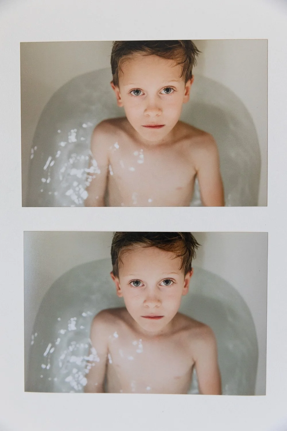
The top image finish is LUSTRE and the bottom is MATTE. Notice the top image is slightly warmer and has more desaturated color overall. There is more color seperation between the boys and the water. The bottom image has softened contrast overall and an obvious cooler skin tone

Next, the top image finish is SILK and the bottom is FUJI DEEP MATTE VELVET. Notice the top image has slightly desaturated color overall and more gray added to the whites and more yellow in the skin tone. The bottom image has a magenta lean (very obvious in the skin tone) and softened contrast overall that gives a film-like quality.

Now compare all of them together: top left: LUSTRE, bottom left: MATTE, top right: SILK, bottom left: FUJI DEEP MATTE VELVET
They all have strengths so I can’t say one is better than the other. If I had to choose one to print larger, I’d say I think the LUSTRE has the truest color… but I did like the softening of the MATTE. It’s a tough call. I think I could rule out SILK and FUJI DEEP MATTE VELVET, only because I don’t love the slight color shifts in those finishes made with this image. This image had a lot of white in it so seeing slight color variations was relatively easy.
Example #2 (hard light, high contrast)

Top image is LUSTRE, bottom is MATTE. You can see more magenta in the LUSTRE finish, especially in skin tone. The shadows and highlights also look ever so slightly warmer in the top LUSTRE photo as compared to the bottom MATTE photo. The MATTE finish showed muted highlights (especially on his face and sweater) that were slightly cooler and had a green lean to them.

Top image is SILK, bottom is FUJI DEEP MATTE VELVET. The SILK finish has rich, dynamic array of shadows and darks and muted, slightly warmed highlights. The FUJI DEEP MATTE VELVET brings up dark tones and makes them more mid tones. I also see a slight magenta lean again in this finish, which is most obvious in the skin tone.

All of them together again: top left: LUSTRE, bottom left: MATTE, top right: SILK, bottom left: FUJI DEEP MATTE VELVET
This time I think the SILK is my favorite finish. It gets the grays exactly right and softens the hard highlights a bit.
Example #3 (black & white)

Top image is LUSTRE, bottom is MATTE. Notice the grays in the LUSTRE finish have a slight magenta tone to them while the grays in the MATTE finish have a slight green tone to them. The details and contrast are sharper in the LUSTRE finish, particularly in the highlights.

The top image is SILK, bottom is FUJI DEEP MATTE VELVET. I notice again a slight green tone in the grays in SILK finish (like MATTE finish above). I also notice the lighter darks in the FUJI DEEP MATTE and I see how that recovers some of the detail in the shadows.
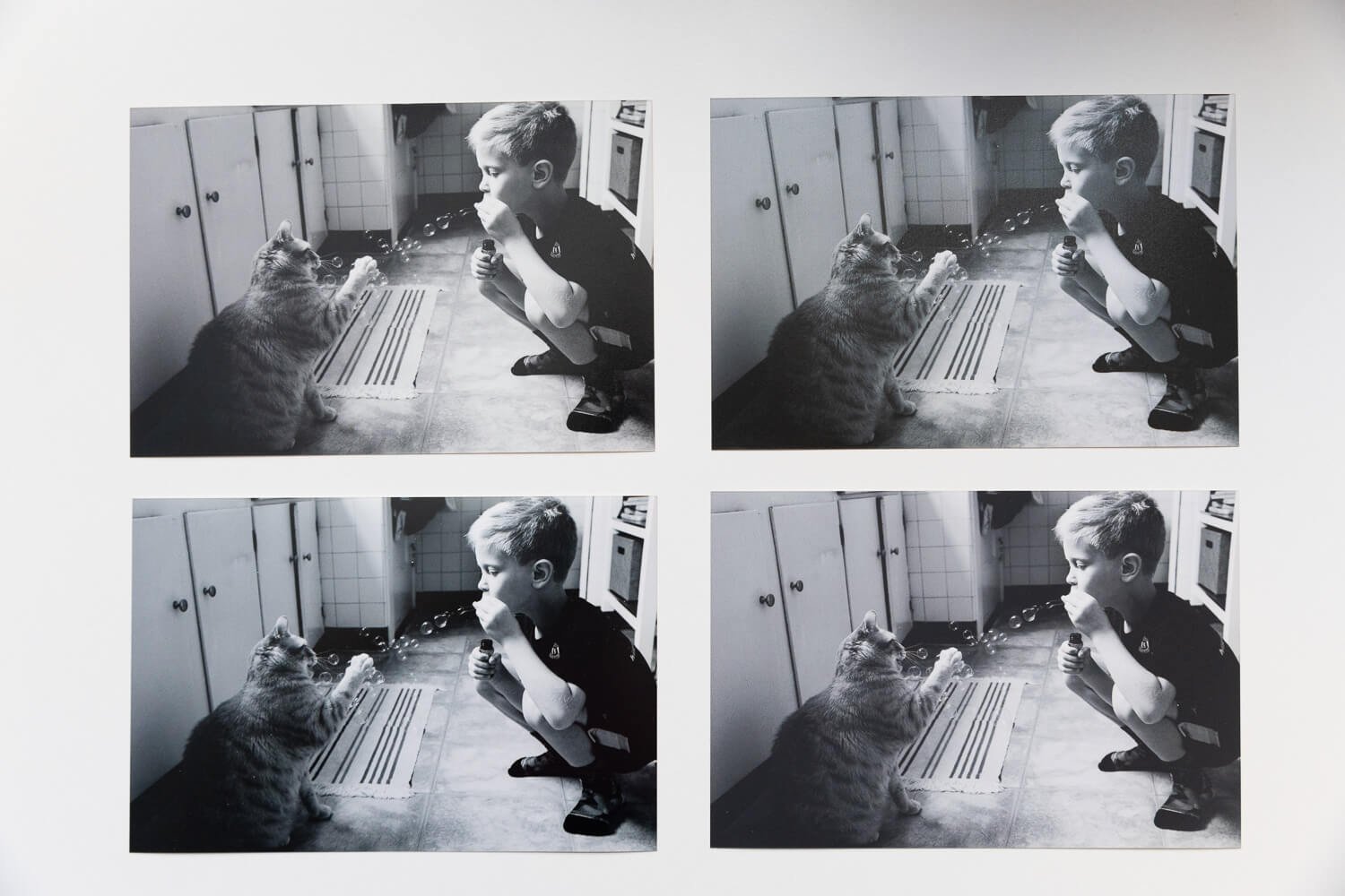
Now all together: top left: LUSTRE, bottom left: MATTE, top right: SILK, bottom left: FUJI DEEP MATTE VELVET
I think I like the FUJI DEEP MATTE VELVET best for this one. When it comes to black and white images, I often like that soft contrast filmy look and I think this finish gets that right. I also like that there is less of a color lean in the highlights and shadows with the FUJI DEEP MATTE VELVET finish.
Test Various Print Finishes Before Printing Big
Hopefully these examples give you a sense of how different finishes can have an impact on how you experience your prints. The differences may be subtle, but when compared side by side, you should be able to identify which finish looks best to you.
The kind of images you you’re wanting to print - whether they have high or low contrast, hard or soft or dynamic light, vibrant or muted colors, etc. - will play into the type of finish that will look best to your eye. My advice to order small prints in different finishes and see what you prefer, especially if you’re planning to order large prints and not sure what finish to choose.
There are loads more options for finishes than just the ones I described and compared here. I just picked the ones I most often select for my own prints. Bay Photo has a great summary of finishes here.
Don’t Let Print House do Color Correction!
If you are printing professionally made photos that have already been color edited, you want to make sure the color doesn’t change when it goes to print. That said, no matter what print house you go with and what finish you choose, ALWAYS be sure you select “No Color Correction” when you’re ordering your prints. If you allow the print house to “correct” the color, the colors you see on your screen might look noticeably different than what you get on your prints. This feature is there mainly for photos that haven’t been professionally edited so unless this describes what you’re printing, it’s best to avoid it.
Want to Hear More From Me?
If this post got you interested in thinking more about print finishes and you want to learn more about other photo-related topics, I have a free guide to taking better and more meaningful photos (with any kind of camera). I also offer one-on-one mentoring opportunities in addition to a variety of portrait and lifestyle photography services. Get in touch! 😍